


Discussions with an industry expert identified a consistent gap — demand for services outpaced what available funding and volunteers could support. Waitlists were long. The organization needed more contributors, not more visibility.
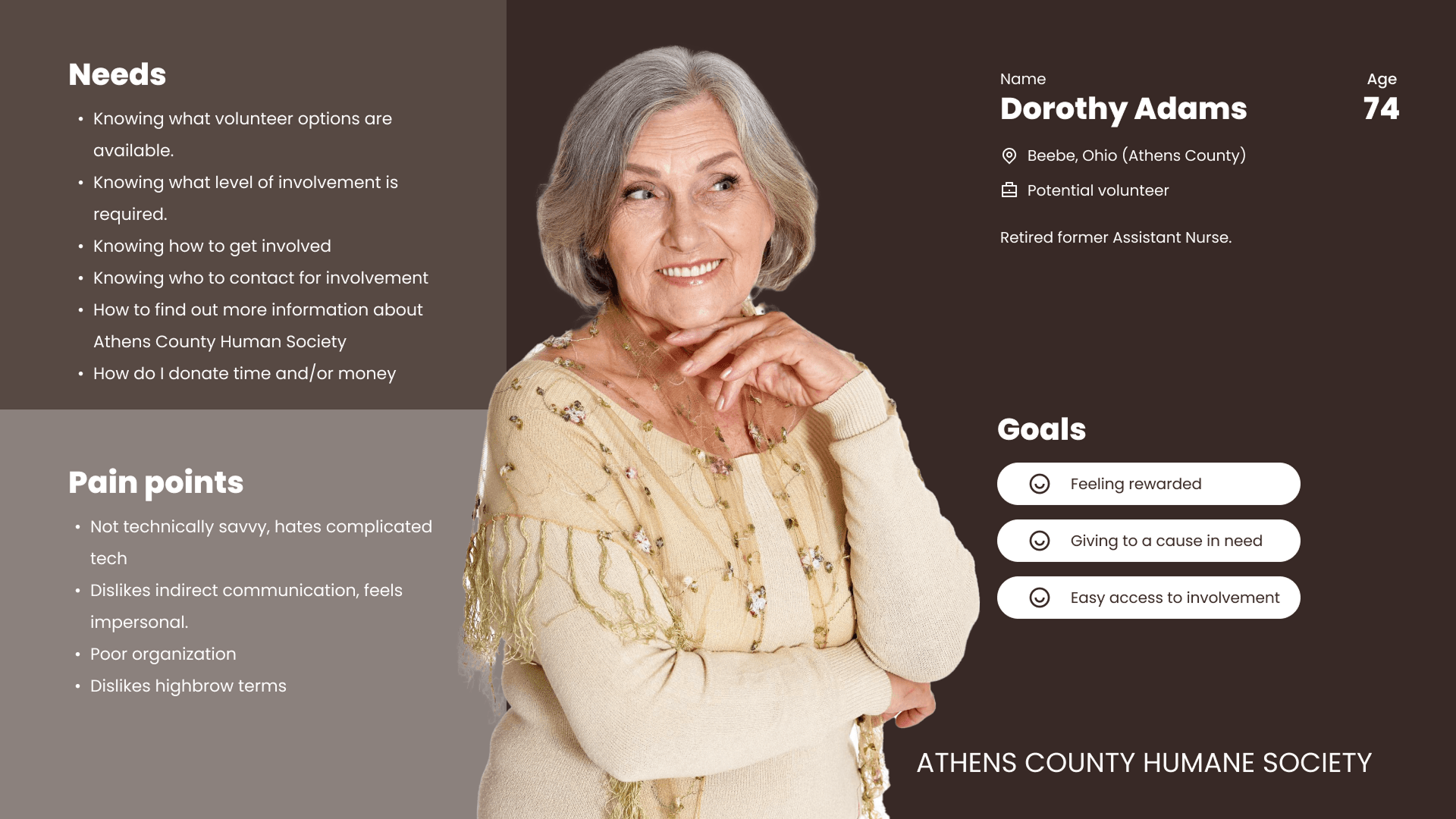
User interviews with the target demographic surfaced a more specific finding. Willingness to give was already there. Nearly every person spoken with expressed genuine interest in getting involved. What was missing was a clear way in.
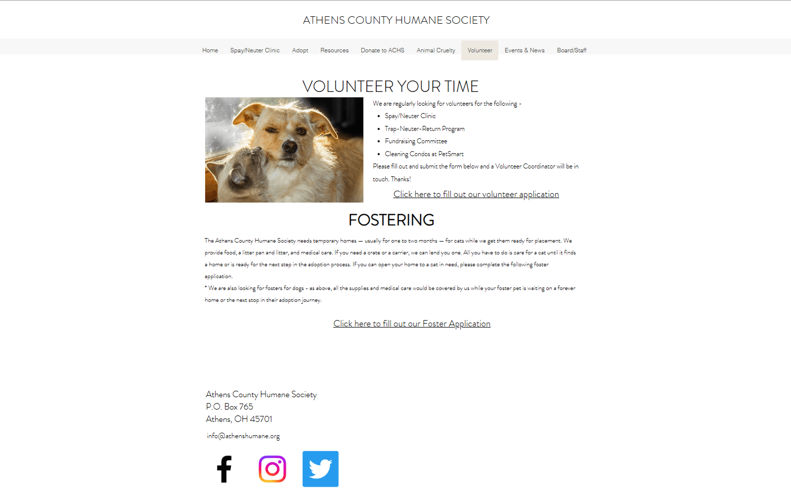
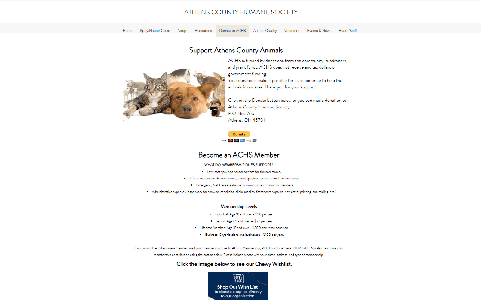
A heuristic analysis of the existing site made the problem concrete. Volunteer sat seventh in an eight-item navigation. The donate page mixed giving options with membership dues on the same surface. The volunteer page offered a bullet list and a single link to an offsite form — no context, no entry points, no sense of what involvement actually looked like.
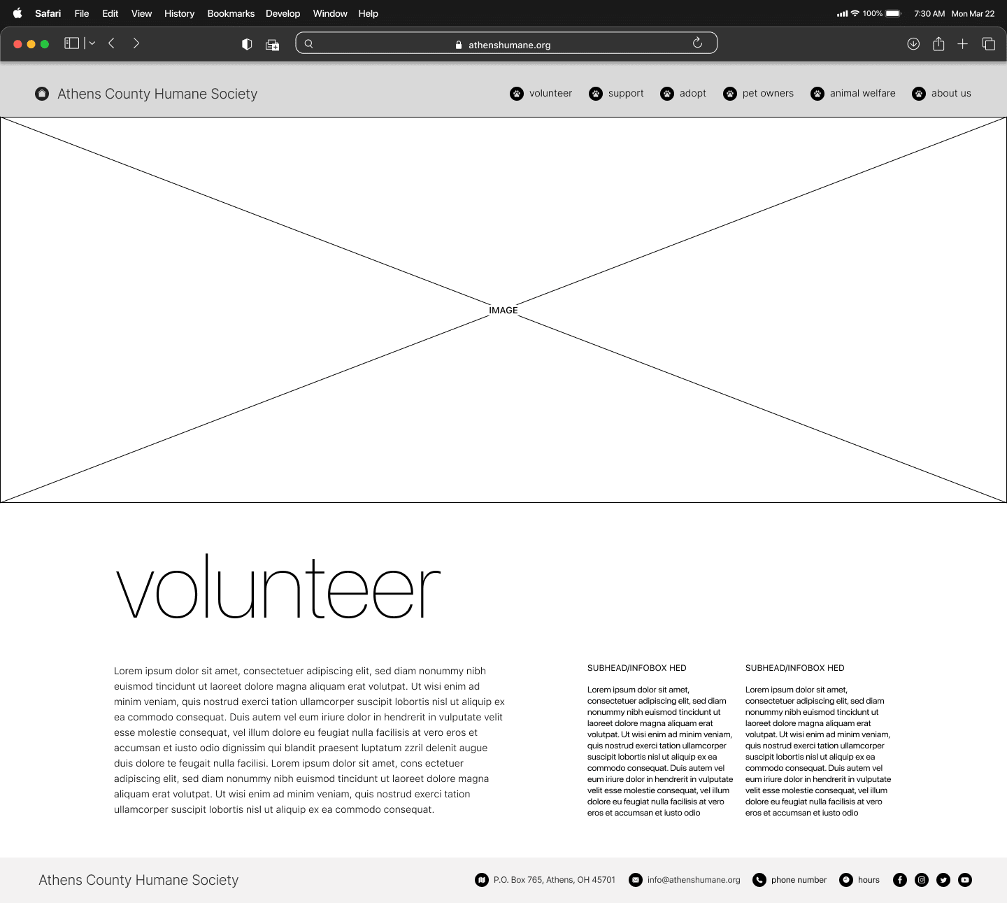
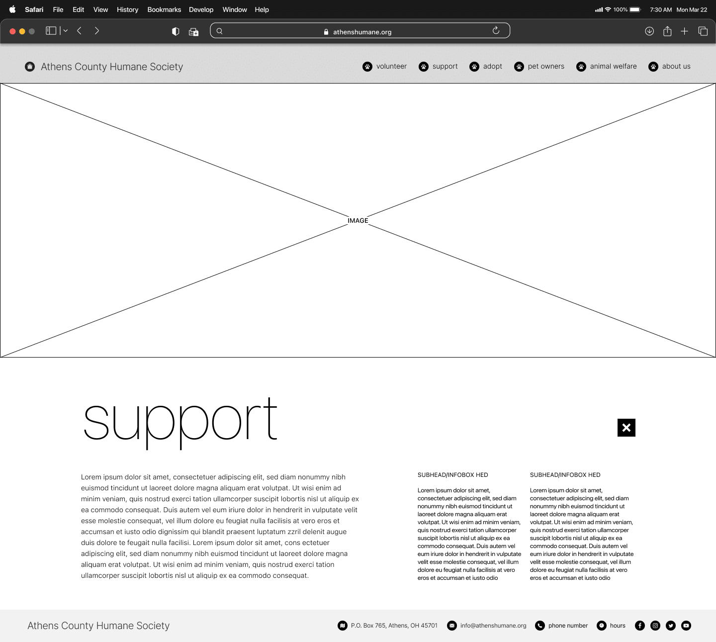
Early wireframes tested the restructured navigation and established consistent page layouts before any visual decisions were made. The focus was scannability — ensuring users could orient quickly and find relevant actions without friction.
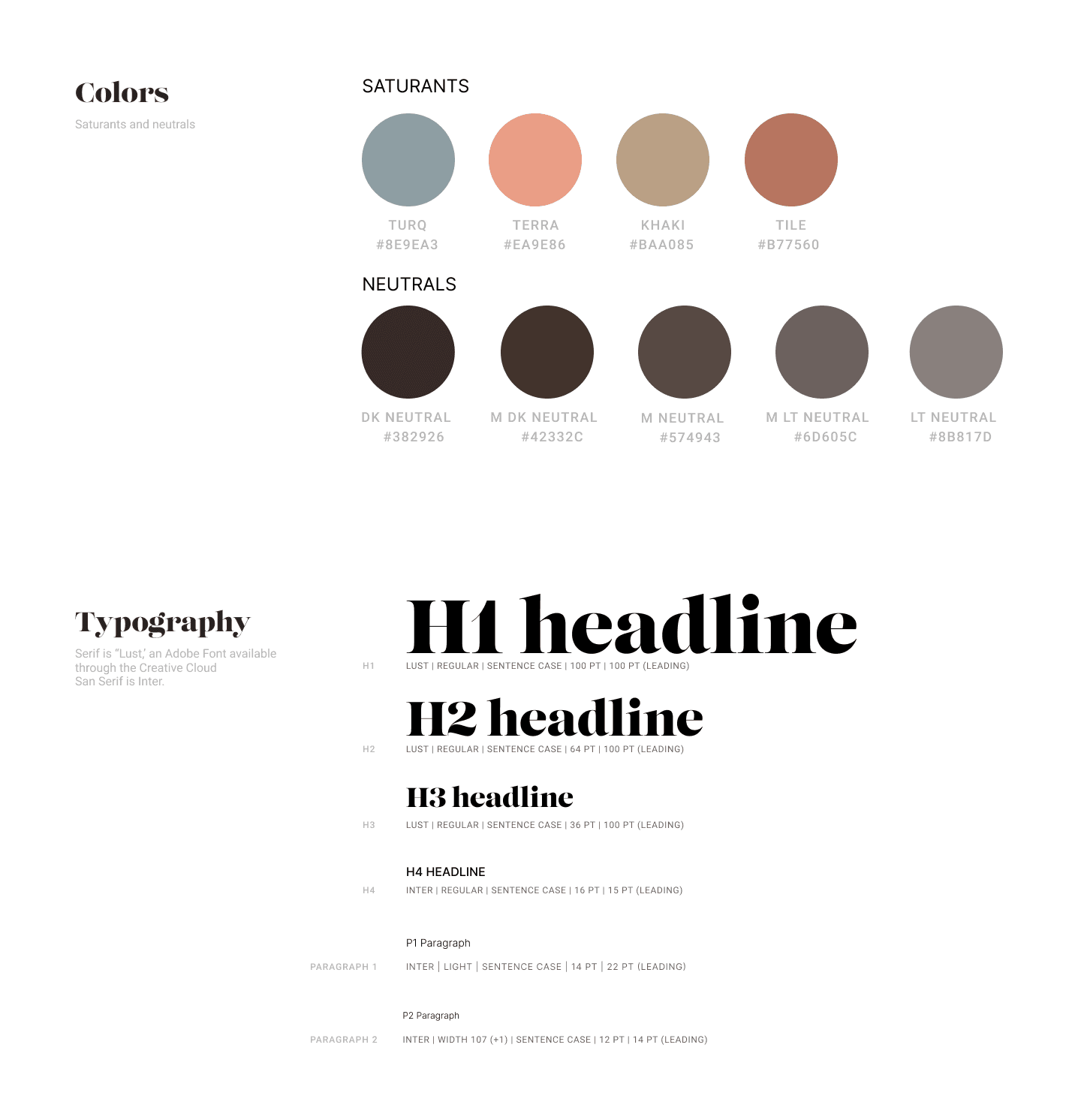
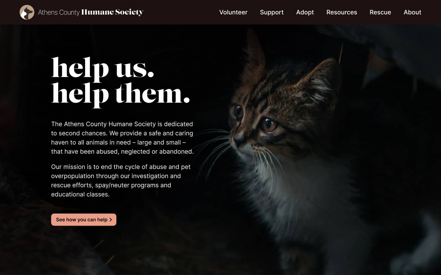
The visual language was designed to feel trustworthy and approachable. A serif display typeface and a palette of warm, earthy neutrals established a tone suited to the target demographic — grounded, direct, and personal rather than institutional.
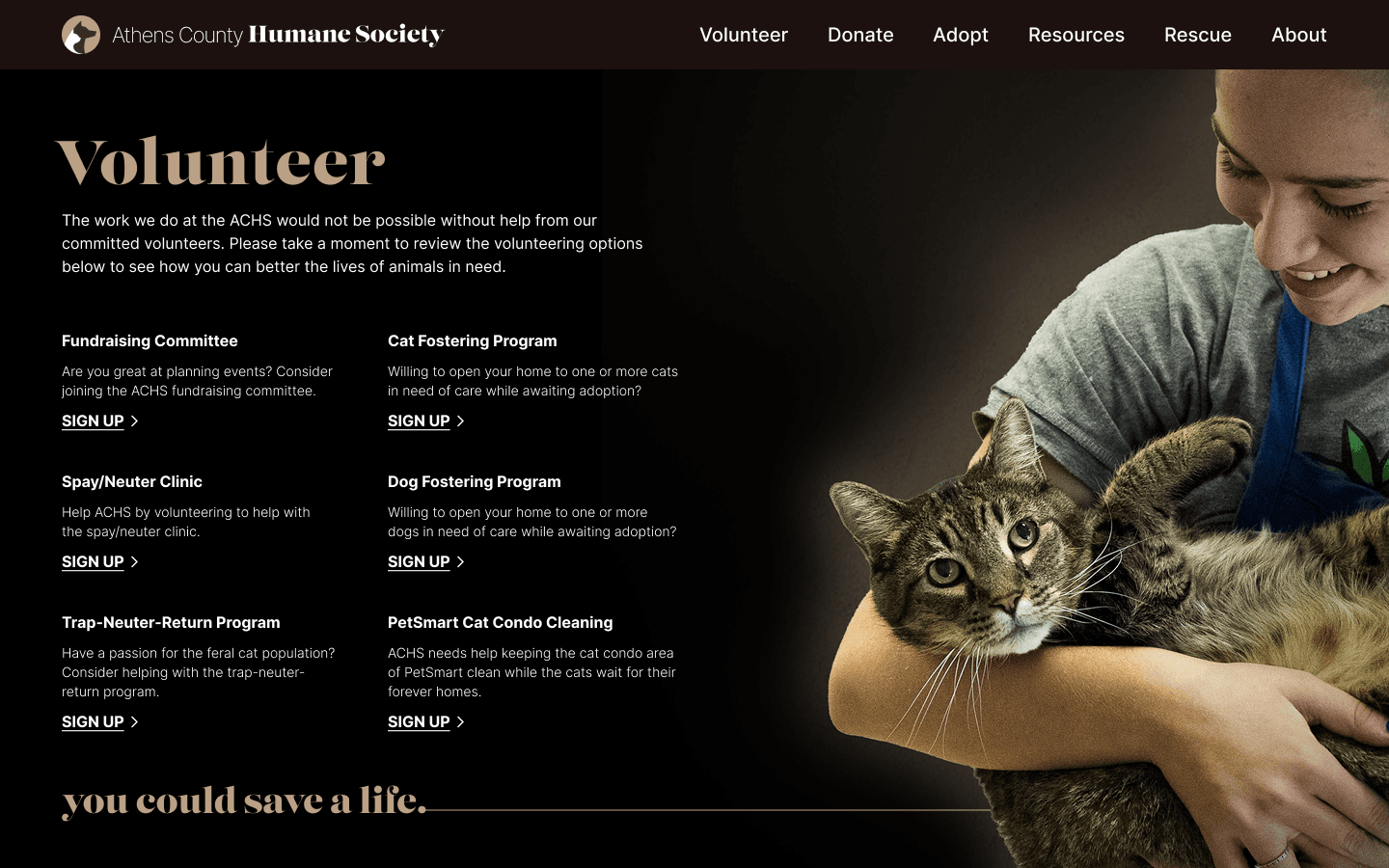
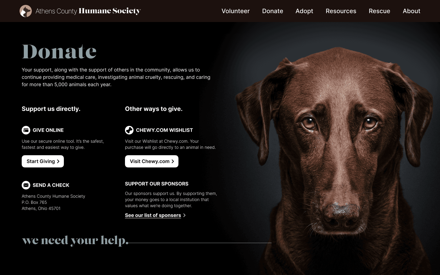
The final designs gave each contribution pathway its own clear surface. Volunteer opportunities were presented as distinct, described roles with individual sign-up access. Donation options were organized by method, with emotional imagery keeping the stakes of the decision present throughout.
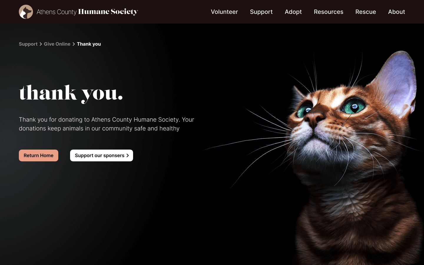
A confirmation screen followed each completed action — providing immediate feedback that the contribution had been received. This closed the loop for a demographic that prioritized feeling that their involvement had tangible impact.